
Before any design hits the fabric, one important choice shapes the final look more than most: the colour of the shirt. This decision affects how inks appear, how they hold up after washing, and even how they feel on the fabric.
When working with a shirt supplier in Singapore, colour selection becomes part of the planning stage. The wrong shade can dull a bright logo, while the right one can make it stand out instantly. A well-chosen colour ensures that every print looks balanced, vivid, and true to its digital design.
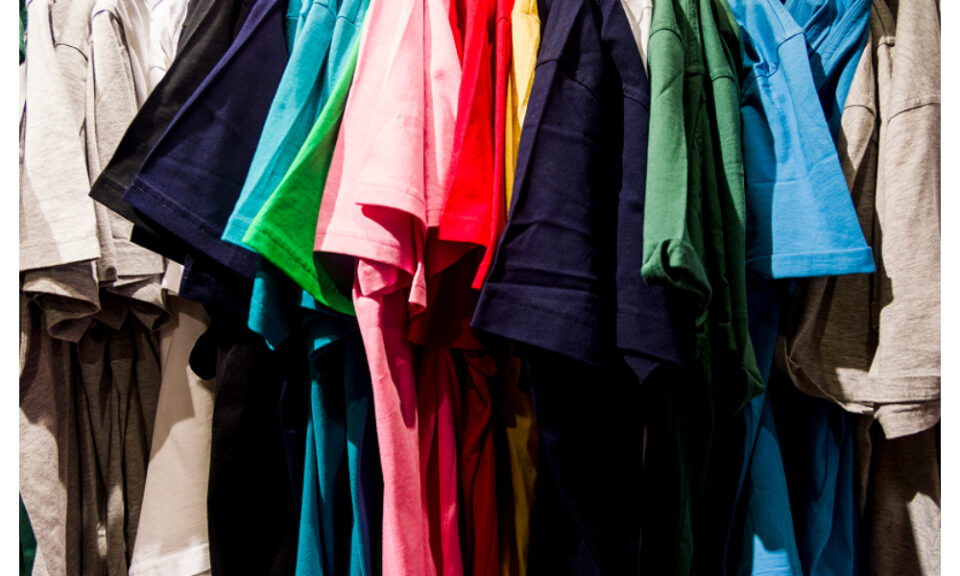
Light vs Dark: The Contrast Factor
Light and dark shirts behave differently when it comes to printing. On white or light-coloured shirts, inks appear vibrant and need fewer layers to show up clearly. The colours blend smoothly with the fabric, creating a soft, breathable print.
Darker shirts, however, require a different approach. Printers often add a white underbase layer before applying colour inks. This extra step makes hues pop and keeps them from sinking into the fabric. The process takes more effort, but the result is rich and eye-catching.
In silkscreen printing in Singapore, understanding this contrast is key. It affects both the appearance and the cost, plus production time. Lighter shirts usually print faster, while darker ones demand precision layering. Good results come from balancing both the design and the fabric tone.
How Colour Affects Ink Performance
Each ink interacts differently depending on the background it is printed on. Bright colours tend to appear stronger on pale shirts, while darker fabrics can alter their tone. For instance, yellow ink printed on black fabric often needs reinforcement to stay bold. This is where technique matters as much as creativity.
With silkscreen printing in Singapore, professionals test inks beforehand to ensure consistency. They consider how the fabric absorbs or reflects light, how thick the ink layer should be, and how each shade reacts after curing. These small adjustments ensure that prints stay crisp and fade-resistant.
The same applies when using specialty inks, such as metallic or glow variants. Their effect can change dramatically depending on the base colour. Choosing a complementary shirt tone allows these unique inks to shine, while the wrong one may bury their detail.
Colour and Fabric Choice Work Hand in Hand
Not all fabrics handle colour the same way. Cotton absorbs ink easily and provides a matte finish. Polyester holds colours sharply but may require special treatment to prevent ink migration. Blended fabrics strike a middle ground, giving both comfort and consistent results.
When collaborating with a shirt supplier in Singapore, you can explore different combinations of material and colour. A heather grey cotton tee will produce a softer look, while a deep navy polyester shirt makes colours stand out with high contrast. Knowing these differences helps you match the right fabric to your design goals.
Ink and fabric compatibility is also key for durability. Light shirts printed with thin ink layers can feel soft but may fade sooner. Dark shirts with thicker layers hold colour longer but may feel heavier. The right balance depends on the purpose of the shirt, whether for events, uniforms, or retail wear.
The Psychology of Colour in Printing
Colour affects perception. Different tones evoke different moods. Red conveys energy, blue feels calm, and black brings sophistication. For businesses, these associations matter. They shape how people respond to a logo or slogan.
In the context of silkscreen printing in Singapore, colour psychology guides many branding choices. A sports team might pick bold shades to show strength, while a charity event may choose bright tones to radiate positivity. The colour acts as an extension of the message, reinforcing what the design represents.
Even within neutral palettes, small shifts make a big difference. A cool grey may appear modern and sleek, while a warmer beige feels inviting. These subtle cues can make a shirt feel more aligned with its purpose or audience.
Matching Design Intent with Shirt Colour
A good design can lose its charm if printed on the wrong background. High-contrast designs need plain bases, while softer artwork benefits from muted tones. Harmony between design and fabric ensures the finished product looks cohesive and intentional.
Experienced printers study mock-ups carefully before production. They adjust line weights, ink density, and placement to suit the chosen shirt. When working with a shirt supplier in Singapore, you can request samples or colour swatches to preview how the final product will appear. This small step saves time and avoids disappointment.
If the goal is clarity, minimalism often wins. Simple designs with strong contrast look sharper and stay readable from afar. For complex graphics, a neutral base helps every detail stand out without overwhelming the eye.
Bringing It All Together
Colour decisions go beyond preference. They shape texture, visibility, and overall impact. Choosing the right shirt tone enhances both the design and the message it carries. Every shade tells part of the story, from vibrant prints that turn heads to subtle tones that speak softly.
Printing techniques and materials continue to evolve, giving designers more ways to bring ideas to life. With the right choices, each print reflects craftsmanship and intent. Contact MonsterPrints to work with experts in silkscreen printing in Singapore and find a shirt supplier in Singapore who helps your designs shine on every shade of fabric.